Celebrating the Culture
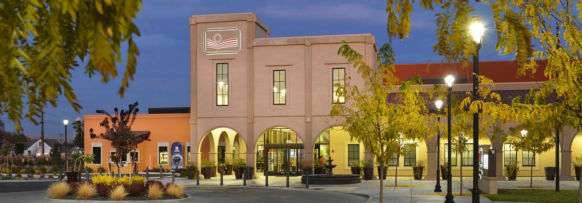
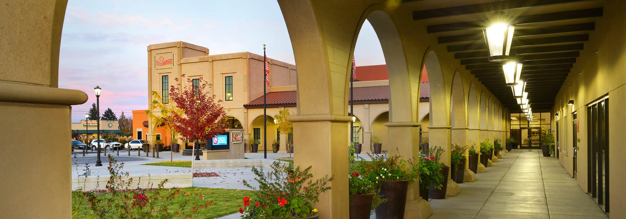
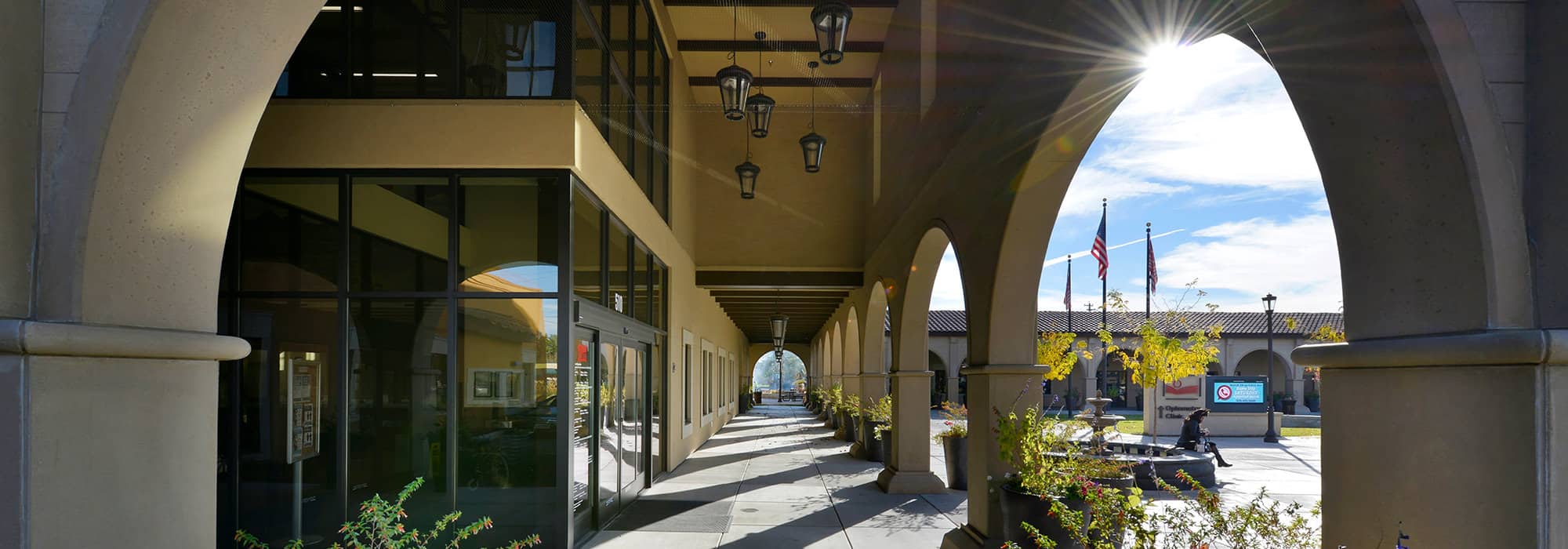
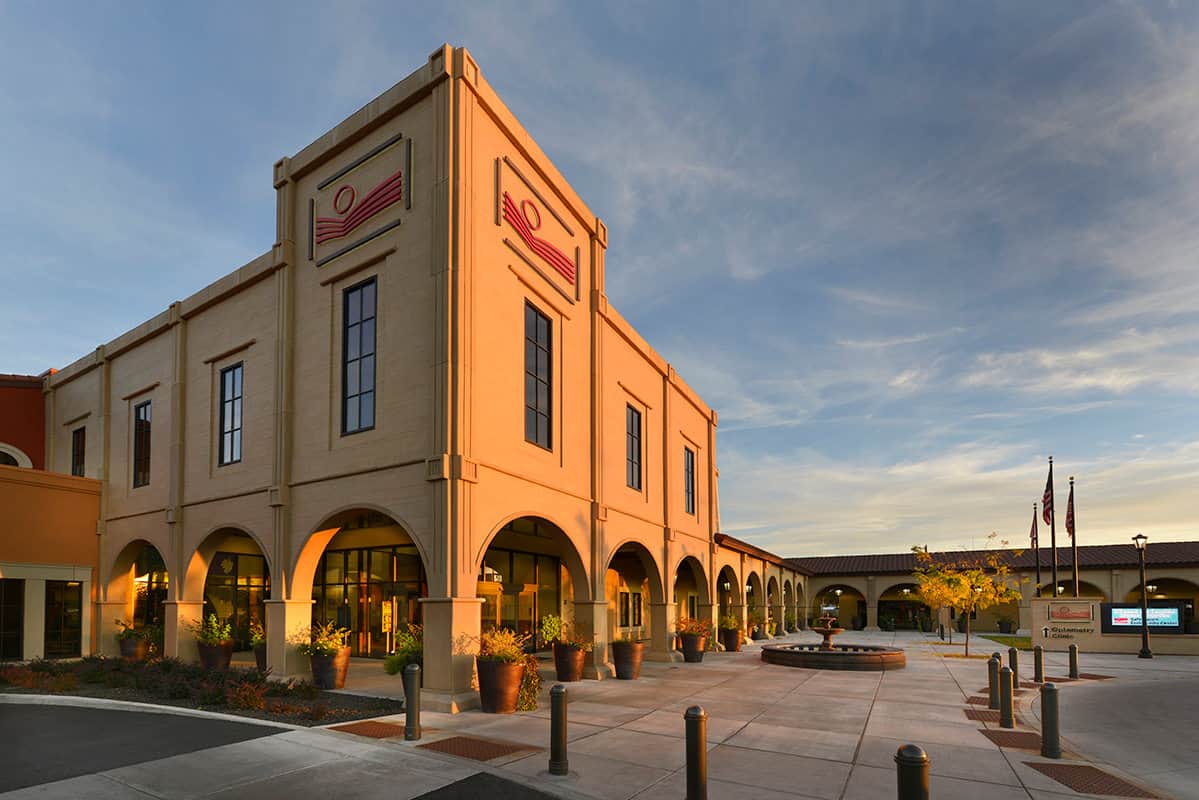
Moved by the warm colors, tile roofs, and high mission arches seen in Latin American architecture, the Yakima Valley Farmworkers Toppenish Medical-Dental Clinic serves as a strong representation of design that is deeply rooted in culture. The building’s character draws heavily from the design and architecture of Yakima’s sister city, Morelia, Mexico.
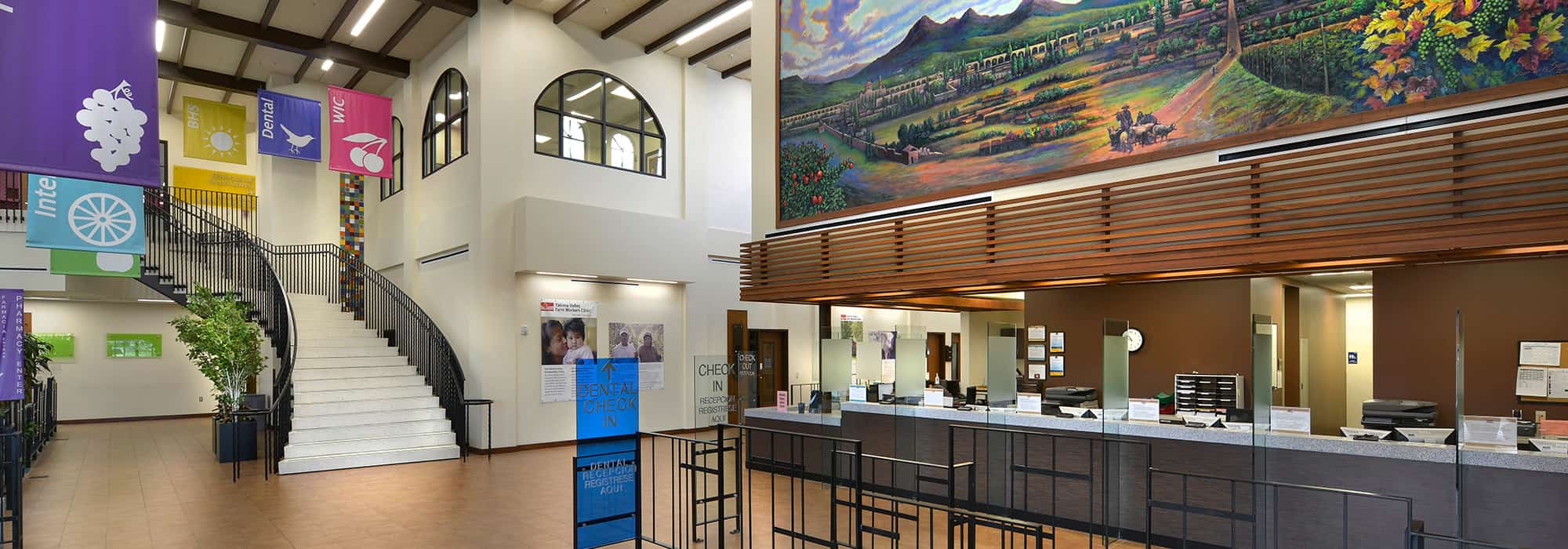
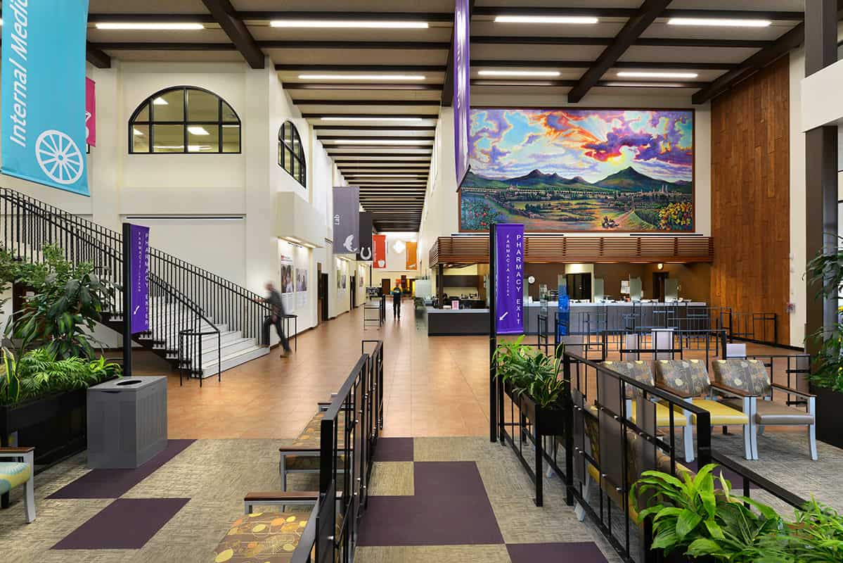
The subtle use of color and form on the exterior of the building melds seamlessly with the warm and welcoming character of Toppenish. On the interior, bright colors and textures add to the visual aesthetic of the space, creating a sense of wonderment and interest. Murals depicting stories line the walls throughout the building and tie to the strong mural culture of Toppenish.
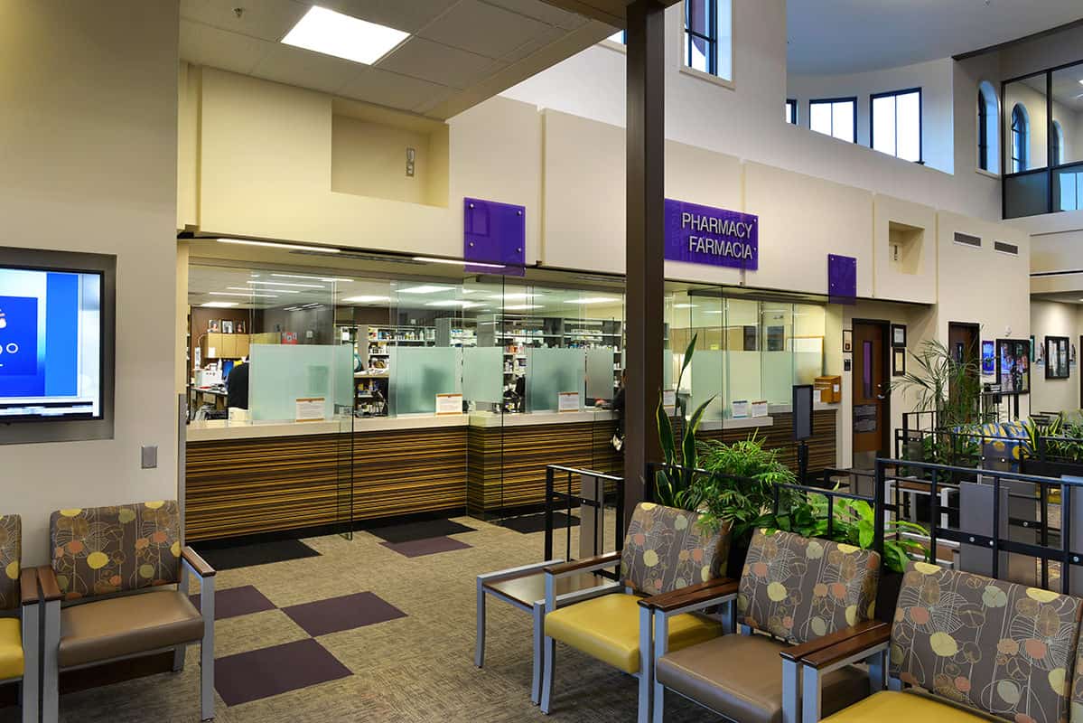
In addition to the strong architectural elements of the building, the clinic was designed with an emphasis on ease of wayfinding. Throughout the building, neutral colors were used on the walls as the backdrop for vibrant departmental banners. The lively colors and icons communicate visually with the visitor and support equitable navigation to each department for all people.
The campus celebrates the Hispanic culture and reflects a sense of community and belonging for the predominantly Hispanic local population. With its strong focus on site adaptability, cultural authenticity, and functionality, the clinic promotes an environment that is comfortable and conducive to a healthy lifestyle.
A Contemporary Translation
At the exterior of the building it was important to integrate details that reflected the welcoming and diverse character of Morelian architecture using contemporary materials. Details such as arched colonnades with regular column patterns and an emphasis on structure surrounding entries and courtyards were combined with rectangular windows with arched tops and strong wide trim. Natural materials and colors and the exposed wood framed ceilings in exterior covered walkways also reflect the more traditional character, but through the use of commercial grade materials.
In keeping with the exterior, the interior was also heavily influenced by Morelian design. Various elements were used to infuse the vibrant and playful aesthetic seen in Morelian architecture. The neutral colors and textures of the walls were used to offset the colorful departmental banners. Colored glass, patterned fabrics, and the integration of murals and paintings help bring the space alive.
